It’s nice to see the strong, clean aesthetic of this building developing through the contrast of color in the precast concrete and sharp aluminum windows. While these office and manufacturing spaces are certainly about efficiency in their production, the “less is more” concept rings true through use of simple, honest form instead of attempting to decorate or hide the building.
Elim Mission Church Construction - The Skylight
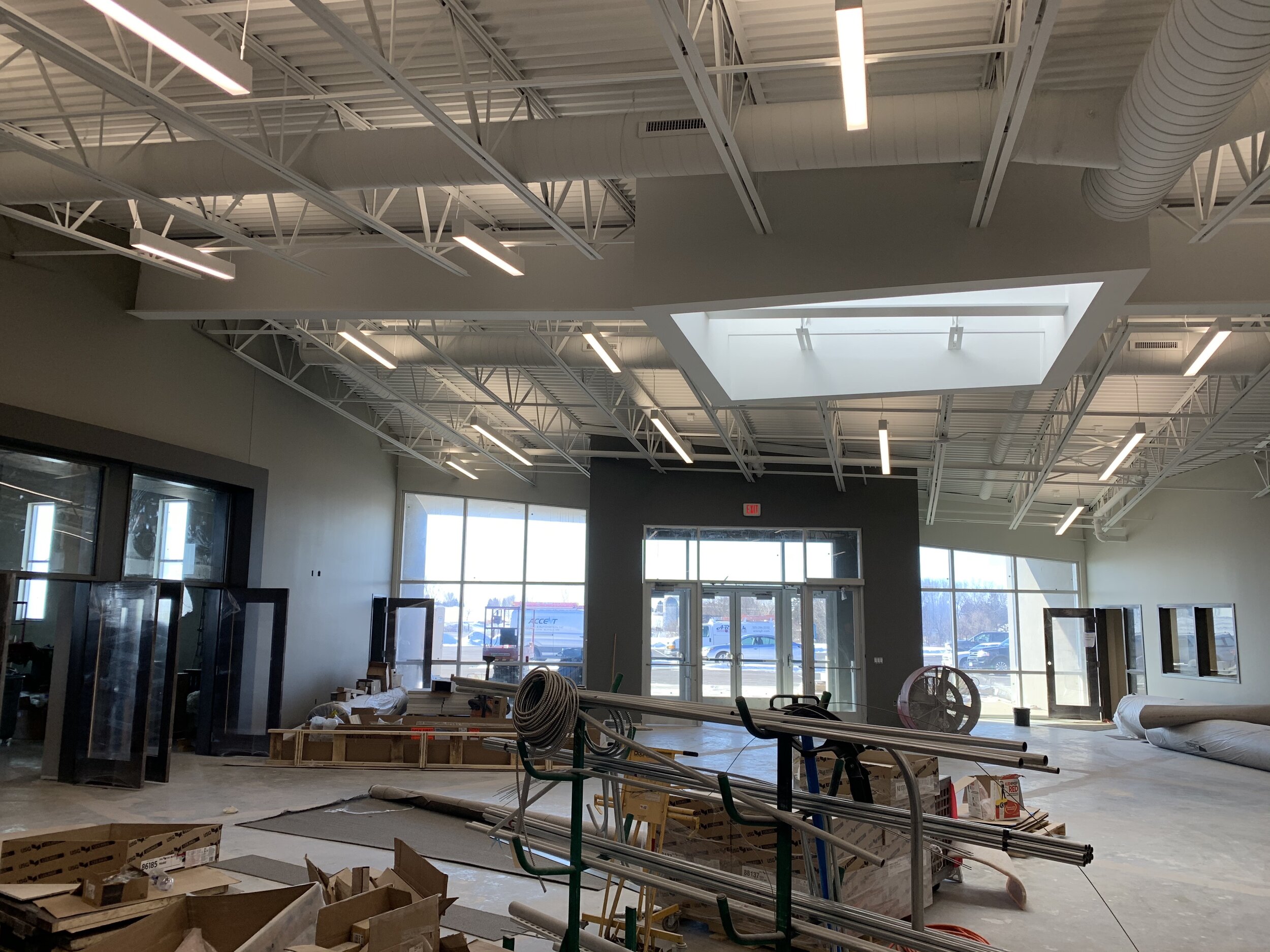
In this post, I will be sharing the progress of another major element of the design, the skylight.
The importance of natural light in the shaping of spaces should never be underestimated. It’s intensity is at a completely different level than artificial light. It adds a dynamic quality to a room that brings life.
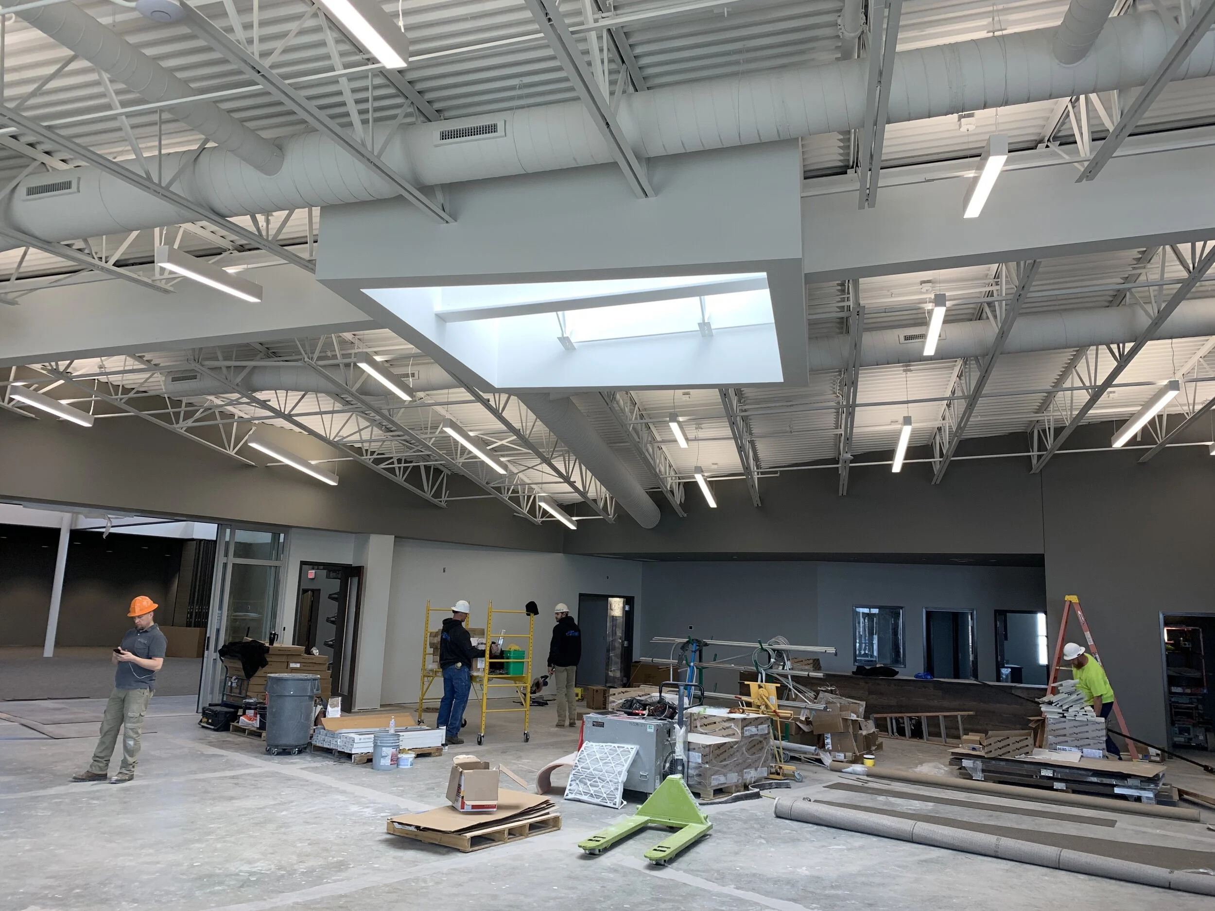
Here you can see the skylight as an architectural form begin to take shape. At first, simply an opening in the roof deck, and then starting to be be framed with steel studs.
This skylight is the first thing that is visible upon entering the front doors.
It then redirects your eye, making use of the central structural beam, and reorients your movement toward the entry doors of the worship space.
The echo or repetition of form, from the skylight to the entry doors, connects these two elements, not only as way finding devices, but also reinterpreting this entry into worship as a metaphorical source of light, similar to the skylight.
The idea of the skylight as a symbolic form was present from early stages in the design, drawing inspiration from Second Corinthians 4:6-7.
For God, who said, "Let light shine out of darkness," made his light shine in our hearts to give us the light of the knowledge of God's glory displayed in the face of Christ.
But we have this treasure in jars of clay to show that this all-surpassing power is from God and not from us.
The concept of light being received and held, as well as clay being shaped by potter’s hands became imagery to express the gathered body of the church being shaped and formed and filled. This lobby space, which presents the different forming ministries of the church, and where the church body as a people gather and see each others faces in the light of this skylight, allows these verses in Second Corinthians to become a visible reminder.
A skylight certainly increases light in a space, but as a form, it is about creating surfaces for the light to reflect off of. This is how light, in a sense, is made visible.
The walls of this lobby enfold and wrap around this space almost like hands, while at the same time drawing you on into the different programs of the church. That flowing movement around the edges is brought into stillness at this central place of light.
As carpet, paint and the other finishes continue to layer into the building, this spatial poem of the potter’s hands shaping the body of the church into a vessel of light continues to take form. But on opening Sunday, when the congregation flows into this space for the first time and sees each other as a gathered body, that will be a special moment of this truth beginning to establish itself in this place, in a very real way.
Elim Mission Church Construction - Approach and Canopy Progress
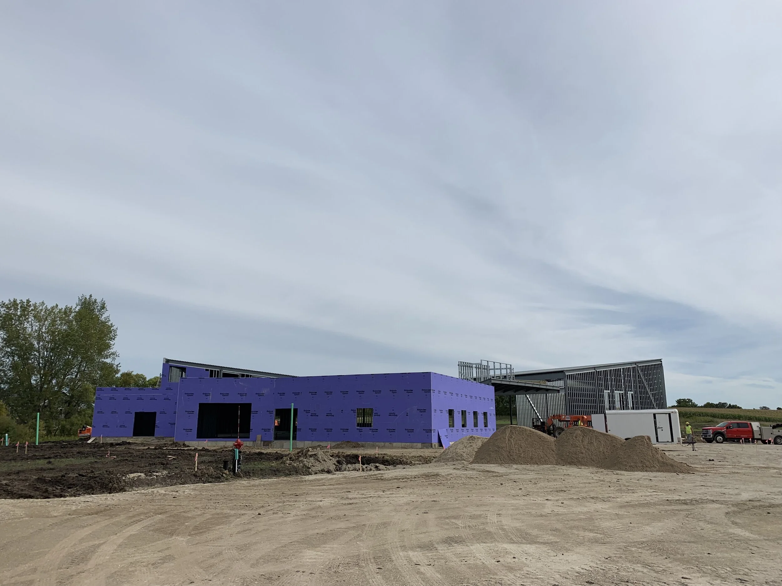
Progress has continued beautifully on the church over the course of these last months. In this post, I would like to focus specifically on how the approach and canopy of the building have been shaping up.
The sloping forms of the roof are one of the most striking elements of the building when approaching from any direction. These roof shapes, with their wing-like quality, rise above the horizon line from certain vantage points as the only visible pieces of the building.
Their sloping lines draw your focus to the center and main entry of the building.
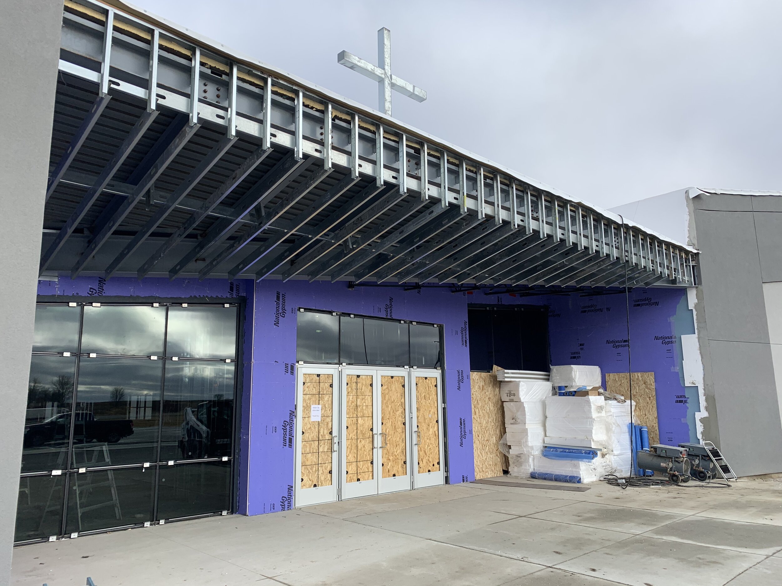
This is where the entry rises up as an element in itself, a distinct gate, as well as a base for the cross.
Although the full church is visible from the highway when driving into town from the east, this particular view, from the bottom of the main entry drive, is partially concealed by the natural topography. This allows the roof forms, with cross and tower at the center, to rest on the horizon line, being clearly framed between earth and sky.
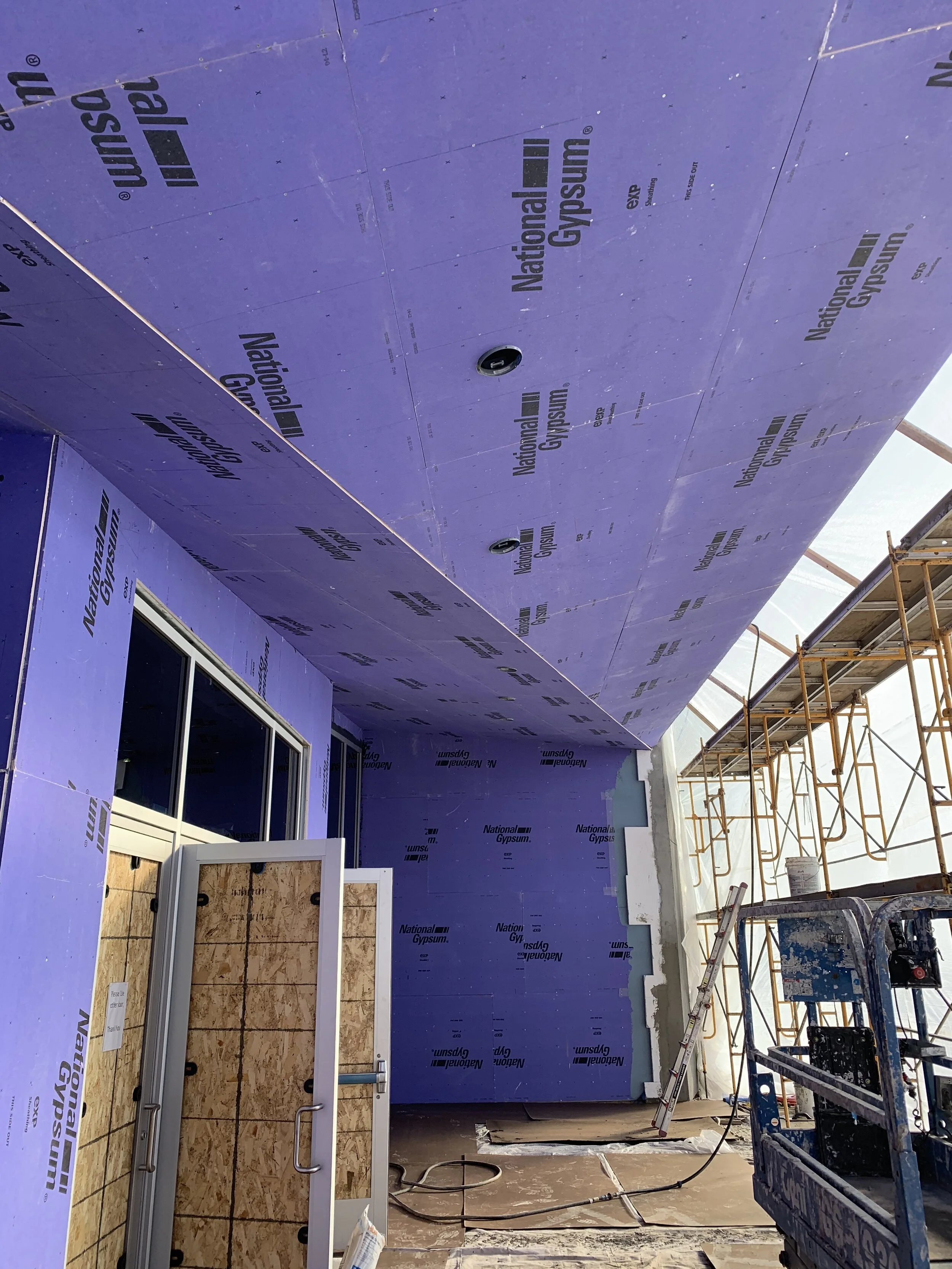
At this central entry, those sloping, wing-like roof forms are continued in a sheltering gesture over the approach.
This canopy form, further communicating the idea of a sheltering wing, is folded, almost aerodynamically and draws those approaching the doors up under the roof in a purposefully active motion of protection.
The unified finish renders the canopy into a single folded form. The white color will ultimately reconnect it with its sloping counterparts in the other roof forms, that will likewise be white both in covering and on their edges.
As control joints are filled with sealant the effect of the continuous sloping form will be complete.
I am looking forward to posting further progress here - especially as the cladding is attached to the entry form.
Let me take refuge under the shelter of your wings! Psalms 61:4


